For many months now, I’ve been following the COVID stats in the Star Tribune, the local Minneapolis newspaper. There’s a lot of interesting info there, but it’s not really useful for reaching conclusions about the safety of various activities. The problem is that the data is either for the wrong-sized area or I can’t group together the bits I care about.
Most of the stats are state-wide. But I don’t care about the whole state. I live in Minneapolis, part of the Twin Cities metro area. We have more than half of the state’s population here. It’s the infection rate in that metro area that really matters to me, as opposed to the whole state. If COVID is under control in the Iron Range six hours north of me, that has very little impact on how risky going shopping at the local co-op is.
They also provide some county-level stats, but there’s no way to view a group of counties together in a historical graph. They also provide per-postal code stats. This is really useless. For example, one of the postal codes that’s most out of control is 56525 on the west side of the state. Their current case count is a very high 170 per 1,000 people. Except that postal code only contains 100 people in total. Insert facepalm here.
The zip code stats for my local area are arguably less useless, as they contain more than 100 people each, but it’s much too granular. I can’t click on dozens of dots and form a mental picture of local COVID prevalence and trends.
So I wrote
my own hacky tool to do just that, using
Perl and d3.js. I start by pulling data from
covid-api.com, which allows to me get the daily infection stats by county.
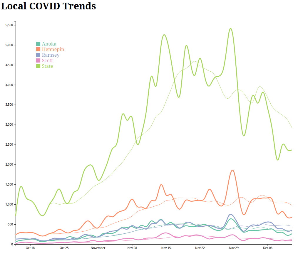
I separate out the four counties I care most about (mine plus a few neighbors). I also have a bucket
for the entire state so I can compare these counties to the state as a whole. There is one line for
each of these, lightly smoothed. Then it adds a thinner past 7-day average line for each of these as
well, so I can get a better sense of the trends. I wish that this API provided infection rates per
1,000 people, but I can still see trends just by looking at daily new infections.
I save all this in a JSON file, and then use d3.js to make a reasonably pretty chart. The API
calls are cached so I don’t beat up the server. Whenever I run the script it’ll download any missing
days of data.
And here’s the end result:
The d3 code is super cargo culted, so I’m sure it’s terrible.
The code is on GitHub, of course. I think it’s usable for other people, though PRs to make it better are welcome. At some point I may try to add a mouseover handler to show the values for each date, like in this example.